SK Barbicane: A Versatile Display Font for Digital Design
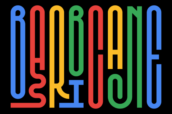
As a UI designer who builds landing pages, SaaS dashboards, and brand-forward e-commerce experiences, I evaluate fonts not just by aesthetics—but by how they perform in real layouts. SK Barbicane stands out as a display font that balances distinct personality with functional clarity. It’s not overly ornate, nor is it generic. Its clean letterforms carry subtle geometric confidence—slightly rounded terminals, open counters, and consistent stroke contrast that holds up across devices and contexts.
What makes SK Barbicane especially valuable for digital work is its adaptability to visual hierarchy. In hero sections, it commands attention without shouting—ideal for headlines above a product demo or value proposition. On mobile, its generous x-height and spacing ensure legibility even at 32px on a 375px viewport. I’ve used it successfully on dark-mode interfaces (with subtle text-shadow for contrast) and over textured image overlays—its structure stays readable where many decorative fonts blur or collapse.
Where SK Barbicane Delivers Real UX Value
Unlike fonts built for print or editorial use, SK Barbicane was designed with screen-first behavior in mind. That shows in three key areas:
- Scanning efficiency: Users skim web content in milliseconds. SK Barbicane’s balanced rhythm and clear character differentiation—especially between similar glyphs like O, 0, and Q—reduce cognitive load in CTAs, feature headers, and pricing cards.
- Brand tone alignment: It reads modern but approachable—not coldly minimal like many geometric sans serifs, nor nostalgic like vintage script fonts. For coaching brands, creative studios, or boutique online stores, it conveys competence with warmth.
- Conversion-focused placement: I consistently apply SK Barbicane to primary buttons (“Get Started”, “Join the Waitlist”) and section titles (“How It Works”, “What Clients Say”). Its presence signals importance without sacrificing elegance—helping users anchor on next steps.
Practical Use Cases Across Digital Products
In my recent redesign of a wellness course platform, SK Barbicane anchored all module headers and instructor bios—paired with a neutral sans serif (like Inter or Manrope) for body copy. The contrast reinforced information architecture: bold, confident headings guided navigation while supporting text remained frictionless to read. Similarly, for a Shopify store selling handmade ceramics, I used SK Barbicane only on category banners and product name tags—not descriptions—to preserve scannability and avoid overwhelming shoppers.
It also works well in constrained spaces: small app badges, newsletter subject lines (when rendered as web-safe fallbacks), and social media cover graphics exported from Figma. Because it’s a single-weight display font, it’s best reserved for short-form, high-impact text—never long paragraphs or data tables. Think: logo lockups, testimonial quotes, feature icons with labels, or animated headline reveals on Lottie-integrated pages.
Pairing & Responsive Typography Strategy
SK Barbicane thrives when paired intentionally. My go-to combination is with a highly legible, variable sans serif for body text—Inter, Open Sans, or Work Sans. Their neutral voice lets SK Barbicane’s character shine without competing. For more editorial or luxury-leaning sites, I’ll pair it with a refined serif like Playfair Display or Cormorant Garamond—but only for subheadings or pull quotes, never body copy.
On responsive layouts, I adjust sizing and tracking carefully. At desktop, 48–64px with slight letter-spacing (+0.5px) gives breathing room. On mobile, I cap it at 36px and tighten tracking slightly to maintain cohesion. I avoid using it below 28px—even for buttons—because its design intent is display, not utility. When overlaying on images, I always add a subtle semi-transparent background or text shadow (rgba(0,0,0,0.4) 1px 1px 2px) to guarantee contrast compliance (WCAG AA minimum).
Licensing, Formats & Technical Fit
SK Barbicane ships as a WOFF2-optimized webfont package—critical for fast loading and Core Web Vitals. It includes Latin-based multilingual support (covering Western, Central, and Eastern European languages), making it viable for global-facing SaaS products or international e-commerce sites. There are no alternate glyphs or stylistic sets, which keeps implementation simple—no need to manage complex OpenType features in CSS.
For commercial use—whether embedded in a client’s WordPress site, bundled into a Figma UI kit, or licensed for an online course platform—you’ll need a standard desktop + web license. Most reputable font vendors offer tiered options based on pageviews or domains. Always verify licensing covers your intended usage: self-hosted sites, third-party builders (Webflow, Squarespace), or template marketplaces require explicit permission. Never assume “free for personal use” extends to client projects or revenue-generating digital products.
A Font That Supports, Not Distracts
In an era where performance, accessibility, and brand coherence are non-negotiable, SK Barbicane earns its place in my font library because it serves a clear purpose: elevate key moments without compromising usability. It doesn’t try to be everything—a body font, a monospace, a script—but excels precisely where display fonts should: guiding attention, reinforcing tone, and adding polish to high-signal areas. Whether you’re launching a new portfolio, refining a checkout flow, or building a cohesive brand kit for a digital product, SK Barbicane delivers quiet confidence—on screen, at speed, and at scale.